The adidas Euro 2020 away kits - ranked
By Tom Gott

It may have taken an extra 12 months, but Euro 2020 is finally inching closer and closer.
It's starting to feel real now, and adidas have helped build the hype by dropping their new away shirts for the tournament, and there are some absolute gems in this batch. Insert shut up and take my money meme here.

Ah, that's better.
You know the drill. Worst to first. Here we go.
8. Hungary
There's nothing really wrong with the Hungary kit. It's nice. It's fine.
Just a bit boring though.
Keeping it simple isn't always a bad thing, but this is just a glorified t-shirt. Thanks, but no thanks.
7. Russia
The Russia shirt is pretty similar to Hungary's, but with a block of colour in the middle instead of down the side.
The flag across the chest makes this shirt stand out, and the fact that it matches up with the cuff does make it look pretty smart.
It's a solid attempt, but with some of the other designs looking so tasty, it's hard not to be a little underwhelmed.
6. Spain
The general consensus around this Spain kit is that 50% of fans think it's stunning and 50% feel as though it looks more like a white shirt that got lost in the wash.
The abstract pattern is nice, but it does seem a little random, and the huge blocks of white on the cuffs look more like tan lines than part of an elite shirt.
Going extra subtle with the flag colours on the sleeve is nice, but what they've done with the rest of that space is a bit of a let-down.
5. Scotland
Dreaming of away days once again.
— Scotland National Team (@ScotlandNT) February 7, 2021
Our @adidasfootball away kit is available now from @JDFootball.
➡️ Shop here: https://t.co/tdkhuNguYa pic.twitter.com/Co5SONWwTx
We're into tricky territory here. Coming fifth on a list of eight might make it seem as though the Scotland shirt is bad, but really, it's actually pretty smart.
The pale blue base would be a little hard to look at, although the pattern completely saves it, and then some.
We're dropping it down because of the combination with white shorts. It just looks a little mismatch, but when you're rocking up to your first Euros in 25 years, you can't really afford to complain.
4. Wales
?? Got your hands on the new @Cymru Away kit yet?
— FA WALES (@FAWales) September 17, 2020
Shop yours now at @JDFootball? https://t.co/TrZ2cmx36t pic.twitter.com/T9WwFdxmga
It's big. It's bold. It's bright. It's a yes from us.
There are some old-school vibes in this Wales shirt, which feels like a modern take on the Hummel design from 1987, and we're all for it.
It's pretty simple, but the few things it does do, it does very right.
3. Belgium
Belgium's new Euro 2020 away kit! Thoughts? ? pic.twitter.com/WaN0ytTAkw
— 90min (@90min_Football) September 3, 2020
It might just be adidas making amends for the monstrosity that is the Wolves away kit, but they've definitely fixed up for this Belgium shirt.
With a similar pattern to the Spain shirt, Belgium's design is a bit more prominent and is balanced out by the bold colours on the sleeve which gives this a bit of a stronger vibe.
Is this going to be the shirt that finally inspires Belgium to greatness?
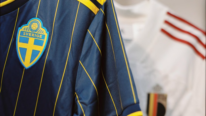
2. Sweden
The top two are so far clear of the rest, it's not even funny.
Firstly, this Sweden shirt? Jeeeeez.
It's classy enough that you could wear it to a nice restaurant (don't do that), but casual enough that you could wear it to impress all your mates (definitely do that).
The pinstripes are next level, and set against the blue background, it's just sublime.
1. Germany
Blackout kits are just so tidy. They're so simple and yet so effective, and that's what Germany are bringing to the table this summer.
What makes this design so smart is the subtle accents on the cuff. Technically, it means it's not a blackout design, but whatever it is, we absolutely love it.
It's probably the simplest shirt in the entire bunch, but it's just done to perfection.