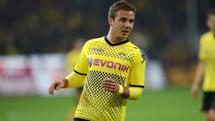
The trademark colours of black and yellow have arguably helped Borussia Dortmund become a hugely recognisable team in global football today.
Other than their successful teams and attacking brand of football, they've made yellow kits looking good a constant, which isn't an easy thing to do at all.
BVB have never really gone beyond using their club colours in their various designs, but occasionally we've seen a stylistic change that has either improved or worsened their looks on the field. And though you might think it an impossible job, here's how we've ranked their ten best home kits of all time.
10. Nike's Pyjamas (2006 - 2007)

This wasn't a popular kit, and Nike wisely chose not to continue with the white-and-yellow stripe combination for the following season, but it certainly was iconic.
The sponsor feels out-of-place and just looks weird, while the top as a whole resembles a pyjama top. Who knows, maybe some of the players chose to wear it to bed.
9. The Highlighter Kits (1995 - 1996)

Is it yellow and black? Sort of.
While the kit design itself looks fine, the shade of yellow feels almost too bright, and definitely resembles a highlighter shade.
It does beat the pyjama look though...
8. Adidas Number (1978 - 1980)
Borussia Dortmund 1979-80 pic.twitter.com/8PROEK7Wpn
— Юлиян Динев (@forever96juli) April 12, 2018
This kit required no fancy designs at all.
Clearly defined, the red sponsor logo does add a bit of colour, acting as a nice compliment to the jersey itself. Plus the retro Adidas sign is always a positive on any football top.
And though Dortmund didn't achieve much success during the time period, at least they were a pleasant sight on the field.
7. The Home-Grown Kit (2001 - 2004)

The birth of the modern Dortmund look? Quite possibly.
You might not know this, but Goool.de was a brand established by the club themselves in a bid to compete against the bigger manufacturers such as Puma, Nike and Adidas.
And this isn't a bad effort at all, with the black v-neck returning to the top, having been omitted in previous years. It looks a lot lighter too, compared to some of the other jerseys their players had worn beforehand.
Sadly, the brand failed to take off, and after Dortmund signed a kit deal with Nike in 2004, Goool.de eventually ceased business operations in 2008.
6. Simply Black and Yellow, from Adidas (1986 - 1990)
Celtic v Borussia Dortmund 1987. First time I saw the Bhoys abroad. Only disappointment was the result. pic.twitter.com/vF1KMMyuMe
— St.Anthony (@Stephen4_2) June 24, 2015
Another kit signed off with the retro Adidas logo, this kit oozes simplicity but also class.
The black lines running along the neckline are a great addition, as well as the stripes along the shoulders.
5. Kappa's Double-Winning Kit (2011 - 2012)

While Kappa didn't make the most eye-catching kits during their partnership with Dortmund, their final offering was clearly their best.
The mixture of black chequered squares and dots was something unique and hadn't been used by many before.
Having your creation won by a double-winning team isn't a bad way to finish up your kit partnership at all.
4. The One with the Lion Badge (1976-78)
The days where no kit manufacturer had their logo emblazoned on the jersey that they produced. How times have changed, eh?
And indeed, this is quite the throwback for BVB fans, as this was the final time you saw a lion on their emblem. This was because of their first kit sponsor Samson, a cigarette brand who had a lion on their own logo. Other than that, this remains a classic Adidas-produced kit, with the stripes, and black neckline.
3. Puma Experiments with Shades (2017 - 2018)

Puma decided to switch it up in 2017, adding interchanging stripes on either side of the jersey.
The yellow shorts were a new addition that made their players visually stand out a lot more, and the shade of the stripes themselves were restrained in a good way - they didn't feel too bold or jarring at all.
2. The Stripey Artic Look (1983-86)
That Lithuania kit is spectacular in a very 1980s way.
— Kevin Kostka (@mpbx3003) March 26, 2017
There's something about this particular kit that gets our attention on every viewing.
Maybe it's the fancy, curly logo of the sponsor. Or maybe it's the bold black lines along the shoulders and top of the jersey.
Either way, the vertical stripes look great here, and of course the Adidas emblem does too.
1. Puma Keep it Simple But Memorable (2013 - 2014)

Dortmund keep it simple.
Black and yellow, no more, no less.
'Nuff said.
