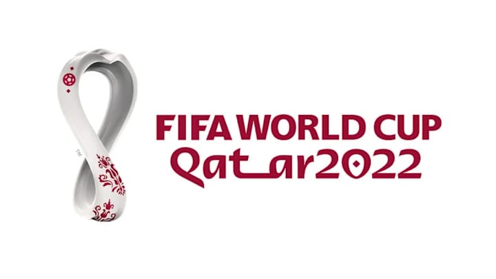
FIFA have officially unveiled the logo for the 2022 World Cup in Qatar, with the new emblem paying homage to 'local and regional Arab culture' as well as the competition itself.
Announced on Tuesday, FIFA released the first images of the new logo which is in the shape of the number eight - the number of new stadiums which have been built for the tournament - but more specifically is actually designed on the World Cup trophy.
The floral patterns at the bottom of the logo as well as the football at the top both reference Qatari culture, while the dots either side of the football are actually Arabic diacritics.

As there has already been bucket loads of controversy surrounding the decision to award Qatar the World Cup in 2022, as well as problems with the conditions for workers who are building the new stadia, the new logo has had a very mixed reception from fans.
Although there are those that are understandably struggling to look past what awarding Qatar the 2022 World Cup has already involved, some fans have noted that they're impressed with the innovative design of the logo, as opposed to just copying a previous instalment.
The Official Emblem of the 22nd edition of the FIFA #WorldCup was unveiled today as FIFA and host country Qatar reached another major milestone on the road to the world’s greatest football showpiece.
— FIFA World Cup (@FIFAWorldCup) September 3, 2019
Read more: https://t.co/QLAMYhKPWe pic.twitter.com/5QSPiwRUp0
One of the best world cup emblems
— pola ayub ️ (@pola_ayub) September 3, 2019
As part of the official video which was released, the curvature of the emblem was shown off as it rotated 360 degrees before returning to the figure of eight shape.
The main reveal for the logo happened in the Qatari capital of Doha, but it was also unvelied at sites in Kuwait, Lebanon, Jordan, Iraq, Italy and France.
