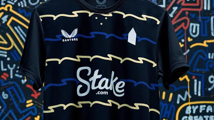
Everton have unveiled their new third kit for the 2025/26 season – and it’s already dividing opinion for one very unusual reason.
Designed by Castore, the kit reimagines the ripples of the River Mersey in a bold, colourful design inspired by local graphic artist Neil Keating.
The black shirt, featuring a crew-neck collar, incorporates an abstract blue-and-yellow pattern across the body, mimicking the flow of the river past Everton’s new stadium. The look is completed with black shorts and matching socks, featuring blue-and-yellow stripes on the fold-over.
But the real talking point is what’s missing.
The third kit features no traditional club crest. Instead, the shirt bears a simple white pentagon on the chest, symbolising Prince Rupert’s Tower – the historic village lock-up that has long been part of Everton’s badge.
While some supporters praised the design as bold and forward-thinking, others slammed the absence of the crest, saying it strips away part of the club’s identity.
Whatever side of the debate you fall on, one thing is certain: when Everton take to the pitch in this kit, they’ll be hard to miss.
Whether it becomes a cult classic or a forgettable experiment will likely depend on the results that come while wearing it. After all, nothing makes a shirt look better than winning.
